Thursday, 25 February 2010

Ancillary Texts

What media texts did you look at to research your ancillary text?
My group took inspiration from the print advertisements that came out for "The Boat that Rocked".
The film had several different print adverts that varied across the board which added more information and shots from the film the closer it was to the airing date, we decided to take this approach as well.I chose to create the teaser advert for our documentary, which would be the first advert to be seen, and was designed to pique the audience's curiousity, and to create interest in our documentary. The ‘Boat that Rocked’ adverts are simple and bold; a solitary figure striking a pose on a bright colourful background, which draws your eye towards the actor.(see presentation) These adverts include little information and only sport the title of the film, a tagline, and a website. These posters are designed to keep the audience wanting to find out more, and making the audience actively access a website dedicated to you movie only increases their interest by increasing their involvement.

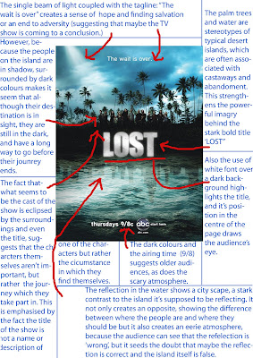
I personally researched a print advertisement for 'Lost', a series made for TV. It too has a simple design that draws your eyes inward and makes the audience's curiosity grow. Unlike 'The Boat that Rocked' the 'Lost' advertisement includes a background, but the stark contrast between the sky and the trees simplifys a potentally complex background, and the bold white text of the title draws your eyes to the centre.This too includes little information as it has only the title, a tagline and the name of the channel it runs on, again making the audience actively become involved if they wish to find out more. I included this in my text having only the title and the symbol of the channel it aires on. The title and posing figure in the middle (like 'The Boat that Rocks') draws the eyes to the centre and catches the audiences attention (like 'Lost') I also used simple colours and a fairly simple background as not to distract from the central figure (like both researched texts) 

How will your ancillary text appeal to the target audience?
My ancillary text appeals to the target audience mainly because it's eye catching. It's bright and bold and stands out from the pages of a newspaper. The simplicity and bright colours as well as the pixilised style it is drawn in appeals to many teenagers (part of our target audience) and the central figure of the skateboarder of course appeals to others who enjoy the sport be it as a spectator or competetor (another part of our target audience.) The title of 'Hateboarding' will also interest adults and teenagers alike as the pun suggests conflict and a differing of opinion, which are subjects many relish watching on television, and thus this helps not only to appeal to our target audience but also those who may not have previously thought a documentary on skateboarding is something they would be interested in.

Where will the text appear?
The Ancillary text will appear in two places mainly. One is in 'The Metro' a free newspaper that is usually given out near train stations so people can read it during their commute. I would place the advert in there as the text is most likely to have a large amount of views and the chances of the audience for our documentary increasing is likely. It also means that members of our intended target audience, who perhaps might not be able to afford the expensive skateboarding magazines. The other place I would print the advertisement would be a plain TV guide, possibly 'What's on TV?' as it is a staight to television documentary, the majority of our potential audience would read the television guide. Also TV guides aren't limited to age and a huge number of people, young and old, read them and so the market for our documentary may increase.

Why are these formats appropriate?
Making a Print advertisement rather than a television trailer is much more appropriate to our audience. Our documentary is based on Skateboarding which is a main stream sport, and as such many of our audience will be outside and on the move the majority of the time (hence printing it in 'The Metro' a newspaper which frequently swaps hands throughout the day.) Having a trailer would be messy and expensive and there would be no way to guarentee that our target audience would be watching the television during the fleeting minutes the advertisement is run for. If the advert is printed on paper it doesn't matter how many people read it, it will remain there for the next person to read, and wouldn't be so easily missed.

Shona  ☺

Research


Youtube is the technology i have chosen to write about, this is because youtube
 allowed our group to watch clips from the films which have inspired us whilst
 making our documentary. This gave us ideas such as aesthetic visuals to keep
 the viewer entertained throughout. Watching clips from films such as;
 'Hot Chocolate' and 'Scratch' has aided the creation of our film because as a
group we knew what to include in our documentary to make it as good as possible.

Wednesday, 24 February 2010

Important Note on Commentary

Complications in recording and uploading our documentary meant that we were unable to use the entire group to record the documentary. Despite the fact the Reiss's and Luke's voices were not included in the commentary, they both were very much involved in the devising of the script and would have been part of the recording had circumstances allowed for it.

Monday, 22 February 2010

file:///Volumes/NO%20NAME/yeeeeeeeeeeeeeeeeah.tiff

Thursday, 11 February 2010

Use of Digital Technology - Photoshop. Hate-boarding print advert

My A2 print advert for our documentary was made using digital technology in the form of photoshop. I used the idea of polaroid pictures and applied this to my advert, I also incorporated generic ideas of "the road" and the freedom which this symbolises for skaters. I think that the utilisation of this idea and its application to my print advert through photoshop is creative. However, I do not think that photoshop developed my creativity because although it enabled me to express and produce this idea into a media text, it did not give me the initial idea and without digital technology I would have still had this creative idea. Even though I would not have been able to express and produce this idea, the creativity of the idea would still have been present as an idea, although this would not have been tangible as my print advert is, it would still have existed as a creative idea. Photoshop gave me the tools to express creativity through digital technology. Photoshop has enabled me to articulate a manner of creativity in an easy way, and I think that having the tools to express creative ideas will inevitably increase creative potential. 
 p

Technology

This is the microphone which we used to record our voiceover and the various audio clips we needed for our the construction of our radio advert. The microphone made it easy and simple for our group to record the voice over rather than using the microphone on the computer; which would have meant recording in the noisy media room with shaky quality and an audible background hiss. I've learnt how to use this piece of equipment as well as the optimum conditions for recording, such as the distance you have to be from the microphone, how loud and clear you have to speak, and the location in which you record. A small room is best as to reduce reverb, with no background noise to detract from the main voice. 


Using this microphone we recorded our commentary for our evaluation. Because each member of our group has to vocally contribute to the commentary, using the microphone meant that we could each go and record our individual segments at the same time, editing the order of the voices when we uploaded the audio onto the computer. If we had used the microphone on the computer it would've meant that we would all have to speak one after the other to avoid background noise, and would have made the process much more difficult to complete.  Utilizing this piece of technology really made our commentary straightforward and uncomplicated to record and upload.

Shona

Monday, 8 February 2010

Wednesday, 3 February 2010

Final film and Radio editing finished

Today as a group me, Luke and Shona finalised all the changes to the documentary radio advert and the editing for our film. We solved the problem of fading out a single track on Garageband and luke has added several relevant images to our documentary. These were the changes that were suggested after the audience screening.

Reiss

Hateboarding Print Advert - Sorcha

USE OF TECHNOLOGY - PHOTOSHOP

Monday, 1 February 2010

Commentary for documentary

According to Stella Bruzzi, “documentary is a negotiation between reality on the one hand and image, interpretation and bias on the other”. We think that this applies to our documentary, as we edited our film in order to present our desired opinion. Our documentary is biased because we consecutively attempt to transmit a certain ideology. We do think that this detracts from the quality of our documentary as any interpretation of anything is, to an extent, fictional, as it is a personal opinion. We believe that documentaries by definition, are biased, and cannot be unbiased as the aim of documentaries is to inform the audience of an issue, while attempting to get the audience to agree with a certain point of view. Our documentary is an expository documentary, as we attempt to expose the unjust stereotypes which are held of skateboarders. 

We choose to put the photo shoped image at the beginning to introduce out documentary. We imported an image of a skater onto photoshop and edited it with dark colours to reflect the serious nature of our documentary. This image is a signifier of the generic picture of skateboarders which people automatically imagine due to stereotypes and bad press. The iconography of the dark colours shows the fear and distrust which some feel regarding skaters, as is the graffiti style text, which shows the illegality which some associate with skateboarders. The audience is made immediately aware of our subject matter. It also added a unique element to our documentary.

We were going to add an animation of a skater which group member shona made to introduce the documentary. However, we were unable to do this as the quality of the animation was considerably impaired by changing to a movie (MPEG) format. Its original format was not applicable to our film. We were also unable to incorporate the title made by group member Reiss as the title would make the audio for the rest of the film out of sync.

We added titles in an attempt to remove the feeling of anonymity our documentary would have otherwise had.

We shot James on a sofa to show him in a comfortable environment and to avoid the interview looking staged and awkward. 

We cut away to a skating clip to make our documentary more aesthetically appealing and to play into the conventions of skateboarding documentaries which we had identified in our pre production research. We found that a typical convention of skateboarding documentaries was to cutaway to skaters, we identified this in documentaries such as Hot Chocolate, which consecutively showed footage of skating throughout the documentary. 

We choose to use a young persons perspective throughout in order to give our documentary a unique selling point through its positivity. We choose young interviewees so that the audience would identify with them, and as a result, identify with our message and our interviewees point of view. As our target audience is young teenagers, we used slightly older teenagers for our interviewees so that our audience would aspire to their ‘skater lifestyle’. We positioned the audience to agree with our message by attempting to create a sense of identification between the interviewees and our audience - we did this by using young interviewees who had friendly and welcoming dispositions and appearances.  

The mise-en-scene of Edward's shot with a river in the background, and on a sunny day to co-inside with the light-hearted message of our documentary. We choose this interviewee because he was articulate and calm, and we thought that this would subvert stereotypes and represent skateboarders as intelligent and unoffensive.

We cut away to laughing skaters in a skate-park to reinforce the message that skateboarders are happy and normal people. The Mise-En-Scene of this shot shows skaters in their regular environment and gives the audience some background info, while the non-diegetic music reinforces the positivity of our documentary.


We attempted to include lots of cutaway footage of people skateboarding as we noticed that this was a convention of many of the skateboarding films which we looked at pre-production, such as "Hot Chocolate". We thought that the use of this convention would appeal to our target audience and make our interviews more interesting, as we could cutaway to skateboarding clips while people were speaking - this tecnique was used in "Scratch", where during interviews there were frequent cutaways to performances.


The shot of interviewee, Jen, was intended to make her appear more approachable, as we thought that her outward appearance may be interpreted as intimidating and this may conflict with our positive message of skateboarders and youth. We thought that the dog, fireplace and soft lighting may make her easier to identify with.


The cutaway to the clip of the skateboarding video game was initially accidental, however, we thought that it worked well as it broke up Jen's relatively lenghtly interview, gave the audience something aesthetically pleasing to look at and gave some diversity to our cutaways.


This clip (bad boy clip) was mainly for comedic effect and to show the irritation which skaters have at being negatively stereotyped.


We included a social worker in our documentary to give a professional and an authoritative perspective opinion. We tried not to force our message on viewers and thought that this may make our documentary slightly less biased, while still enabling us to transmit the main message. We filmed her in her office to show her professionalism and position of relative authority.


We choose skaters who were possibly slightly older than our target audience so that they might be aspirational figures, increasing the market for our documentary. We included people smiling with friends to sell a lifestyle of popularity to our target audience, young male teenagers, who would aspire to this. We tried not to make our skater interviewees too old, so that our audience will still be able to identify with them - further increasing the potential market for our film.


We added a voiceover to our documentary to incorporate some factual information, and to avoid our documentary being completely opinion based. We did this in an attempt to educate our audience and abolish any negative stereotypes, and to present a positive picture of youth.


We added this clip to give our audience an interesting insight into the background of skateboarding, allowing them to better understand the opinions expressed in our documentary.
We used this cutaway to cover up a zoom which was unfocused and shakey.


The Mise-En-Scene of this shot with Daniel shows the freedom and self expression which skateboarding represents for him. We thought that the lighting and visuals of this shot made it one of our most aesthtically pleasing interviews.


We choose to begin to expose some of the harrasment and verbal abuse which skaters have been subjected to simpley because they are skaters. We thought that this would challenge stereotypes.


The Mise-En-Scene of Edwards shot with the teddy subverts stereotypes of threatening skateboarders and makes him appear as non-offensive as possible. We also thought that it added subtle humour to our documentary. The non-diegetic music which we have used throughout also reflects the non-offensive tone of our documnetary and the non-offensive message which we are trying to transmit regarding skateboarders.

We had a phone interview with Rory Milanes but the audio was very unclear, so we decided to give the script to someone to read for us
We thought that the subtle movements which Daniel made, made him look at ease with the situation and the interview.
We continued addressing stereotypes which others held of skateboarders and hence, Daniel himself, and attempted to discourage these by trying to make the audience identify with him. We thought that consecutively using the same people (Edward, James and Daniel), allowed our audience to identify on a more personal level with our interviewees. If they were liked, our audience would be more likely to take on board what they say.


In this shot the Mise-En-Scene shows the relaxed side of skaters in their own enviroment. We thought that our ending showed skaters in a positive and non-menacing light, and also attempted to provide our audience with positive representations of modern youth.


Daniels jumping shot emphasised his friendly and carefree personality and acted as a humourous segues to the ending credits.

While we adhered to genre conventions such as voiceover transitions and cutaways, we thought that our documentary is untypical as it presents a positive message about contemporary youth and seeks to show the creative and enthusiastic side of youth which is often neglected in the media. Popular documentaries such as Micheal Moors film focus' on a negative situation or mindset and elaborate on how deep rooted this negativity is. We decided to subvert this convention and present a positive perspective.

Wednesday, 27 January 2010

Production Team


Photoshop - use of technology 


Here is the logo for our production team called "High Peak Studios"
The futuristic font has connotations of modern aspirations often connected with modern youth and the silhouetted figures high fiving create the 'High' part of the logo and the shape of their arms creates the 'Peak'. High fiving is, again, something often thought of in relation to the modern youth; which is what our production team is made of.
Shona

Teaser Advert Analysis

Photoshop - use of technology Shona

Monday, 25 January 2010

Teacher Feedback

Consider the following:

1. Are there places where you can include titles/text? (When James is playing games, something about the popularity of skating boarding video games) Any other statistics?

2. Can you add a change of music, like when skateboarding? Voiceover?

3. Add other images-you could used archival images of skaters from the past.

Wednesday, 20 January 2010

Teaser Advert for our Documentary


This advert only has the Channel and Title of the documentary so it piques the reader's interest and if they want to find out more they can check the Channel 4 website. Adverts with more information would come out closer to the air date.
Shona
use of technology - photoshop

Potential Advert Placement


Because our target audience are young people, teenagers to mid 20s, I thought that advertising it in the Metro newspaper would get us good publicity. Because it is mainly aimed at young adults and above, teenagers would also read it, as they are becoming more mature and independent. Even though our documentary is focused on skateboarding and the skateboarding community, advertising in the metro would let us expand our target audience and expose people positively to skateboarding, people who may have only heard the negative stereotypes before. Also the metro is a free newspaper which would allow us to get the message out to as many people as possible, including those who enjoy skateboarding who may not buy an expensive skateboarding magazine, but would still be interested in our documentary.

Shona

Print advert for our documentary

use of technology - photoshop
Made by Reiss

Publications suitable for the advertisement of our documentary

I think that a relevant magazine in which we could advertise would be Sidewalk Skateboard Magazine. I think that this would be appropriate as it is a magazine based on skateboarding, and so it will inevitably have a readership of skaters who would be interested in our film. It also has a target audience of primarily male teenagers, as does our documentary. The ideology of the readers of the magazine would also be similar to the ideological standpoint of our target audience, as they are of the same age, gender, social class and have a considerable interest in skateboarding, as is required for our target audience. Advertising in Sidewalk Skateboard Magazine would help us reach our target audience and encourage more people to watch our documentary as the readers of the magazine would inevitably be interested in a documentary about skateboarding as they themselves have a keen interest in skateboarding.

Another magazine which I think may be relevant for the advertisement of our documentary would be Kingpin Skateboarding. This will be appropriate for many of the same reasons as Sidewalk Skateboard Magazine - it is a skateboarding magazine. Kingpin Skateboarding will also appeal to a slightly older target audience as well as our intended target audience. This may widen our circulation as some older skateboarders may well be interested in our documentary.

I think that we could also advertise in a liberal newspaper such as The Guardian as although the audience is very different, they appeal to left wing liberal interests and have considerable youth readership, and although the readers may not be interested in skateboarding, they may be interested in watching our documentary because of the positive message which it transmits about youth today.

Reiss's

http://live-magazine.co.uk/
is the magazine i would like to have our print advert in, this is because this magazine caters for young people in south london, it is a very versatile magazine because there is always information in every scene of youth because it is made by young people. this magazine is free and distributed to almost every school, library and youth club in the area.

Printed Advert Publication

Sidewalk magazine
Kingpin is the UK’s leading national skateboarding magazine, and is the only mainstream nationwide skateboarding publication since ‘document’ magazine shut down a few years ago.  Because of this, sidewalk has cornered the market in UK skateboarding.  Although they have a newfound popularity within distinct areas, few ‘scene’ magazines are actually printed, most being purely online blogs and even less are found in anything but the skateshop for the local scene.  Because of this to have UK skateboarders actually see the advert en masse, sidewalk is the best bet.
We would be interested in printing an advert in sidewalk magazine because it focuses on our main audience demographic, and will be seen by skateboarders across the UK. This means that we can viably create a large amount of interest in a small amount of time.

Print Advert Analysis: Lost

use of technology - photoshop

Shona

Wednesday, 13 January 2010

Print Advert Analysis

use of technology - photoshop

print ad analysis

use of technology - photoshop
posted by Reiss

Wednesday, 6 January 2010

Interview with harrassed skater

Yesterday afternoon I was able to conduct an interview with a skater who had been harrassed and stereotyped. I believe that this interview will help to round off our documentary and illustrate our point about the stereotyping of young people. We have yet to add titles to our documentary and upload the final two interviews and incorporate them into our documentary, we also need to put the credits at the end of our film. After this we will have completed our documentary.

Monday, 4 January 2010

Last minute interview - professional skateboarder

We have scheduled an interview for this afternoon with Daniel Chapman, professional skater. Hopefully this interview will give our documentary a more professional edge. Shona and I will film him today.
Some questions which we have prepared are as follows:
How did you get into skateboarding, how old were you when you began?
Do you find that people stereotype you in a negative, or possible positive, way?
What do you like about skateboarding?
Have you ever been harassed due to being a skateboarder?
How did you get into the professional world of skateboarding?

Completed Animation

I completed the animation which opens our documentary. Short and consise, it leads easily into the title screen and helps to introduce our topic; showing a skateboarder as he performs a trick. The style is simple, cartoonish like 'Persepolis' and using the bold colours and stark back lines and shadows i found so appealing from 'Waltz with Bashir' All in all I am very happy with my final result and I think it works well as the opening sequence of our documentary and helps to start it in an interesting and unique manner.


Shona (Below a screen grab from the opening animation)

Use of technology through animation

Questions regarding our radio advert

Are you able to understand or have an idea of what our documentary is about after hearing our radio advert?
Does our radio advert appeal to you and encourage you to watch our documentary?
What age group do you think our radio advert is targeted to, do you think that this is limiting in terms of marketing?
Which radio station do you think that we should broadcast our podcast on?
Were the audio clips clear and understandable?
Was the music audience and topic appropriate?


Sunday, 3 January 2010

Reschedualed interview

Unfortunately my interviewee - the harrassed skateboarder, was unable to make our last appointment. However we have reschedualed for Tuesday, January the 5th at 15:00pm.